Analytics
Every shortened link on Viso.li collects analytics automatically. This guide walks you through each section of the analytics dashboard so you know exactly what data is available and how to read it.
Subscription-dependent features
Overview
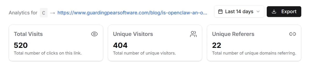
At the top of the analytics dashboard you will find three summary cards that give you a quick snapshot of your link's performance:
- Total Visits: the total number of times your shortened link has been clicked.
- Unique Visitors: how many distinct visitors have clicked your link.
- Unique Referers: the number of different websites or sources that sent traffic to your link.
These numbers update in real time and provide a helpful starting point before diving into the detailed sections below.
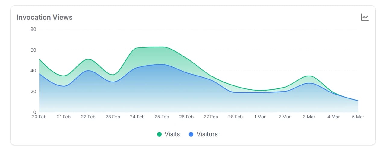
Views Over Time
Below the overview cards you will find an area chart that plots visits and visitors over time. This chart helps you spot trends, identify spikes in traffic, and understand when your link gets the most attention.
The chart adjusts its granularity based on the selected time range. Shorter ranges display data by the hour, while longer ranges group data by day.
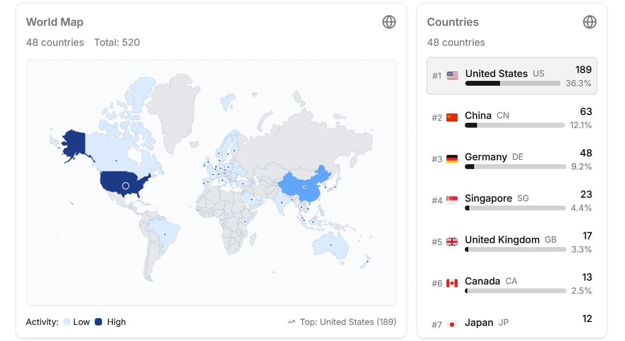
Geographic Insights
The world map gives you a visual overview of where your clicks originate. Countries with more traffic appear with stronger highlights, making it easy to see your top regions at a glance.
Next to the map is a country list that ranks each country by click count and shows its percentage of total traffic. Clicking a country on the map or in the list filters the entire dashboard to show only data from that country, including a region-level breakdown.
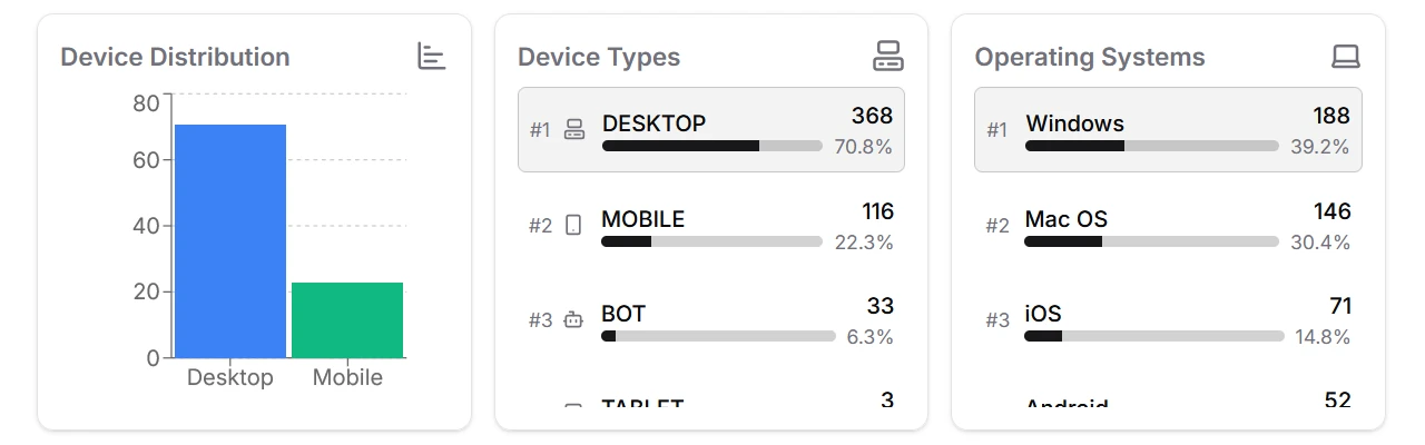
Device Breakdown
This section shows how visitors access your link. It is split into three cards:
- Device Distribution: a bar chart comparing mobile, tablet, desktop, and bot traffic.
- Device Types: a ranked list of device categories with click counts and percentages. Clicking a device type filters the entire dashboard.
- Operating Systems: a ranked list of operating systems your visitors use, such as Windows, iOS, or Android.
Understanding device and OS data helps you tailor your content and landing pages for the platforms your audience actually uses.
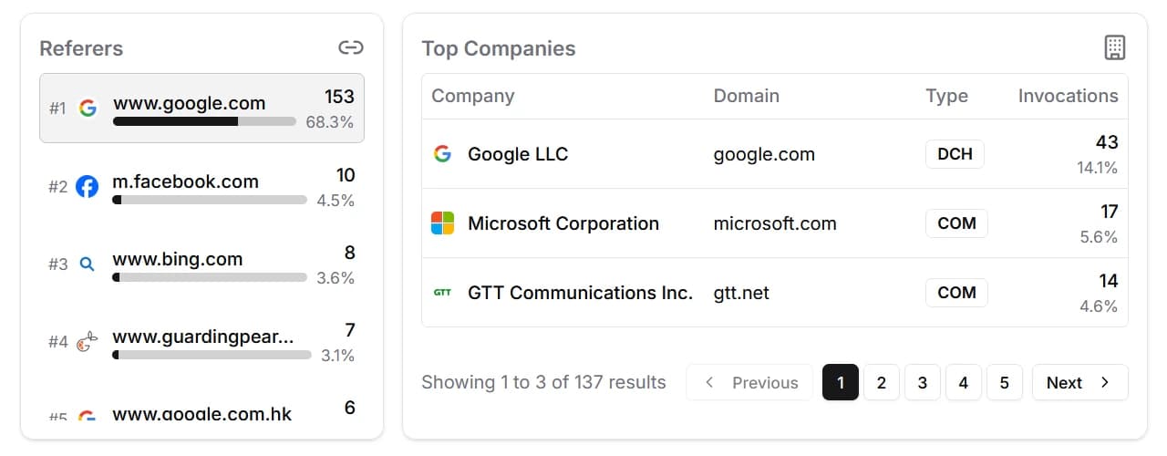
Referers and Top Companies
The final section reveals where your traffic comes from and which organizations generate it:
- Referers: a list of websites and platforms that sent visitors to your link, ranked by click count. This is useful for understanding which channels drive the most engagement.
- Top Companies: a list of companies and networks (identified by ASN) that your visitors belong to. This can help you gauge interest from specific organizations.